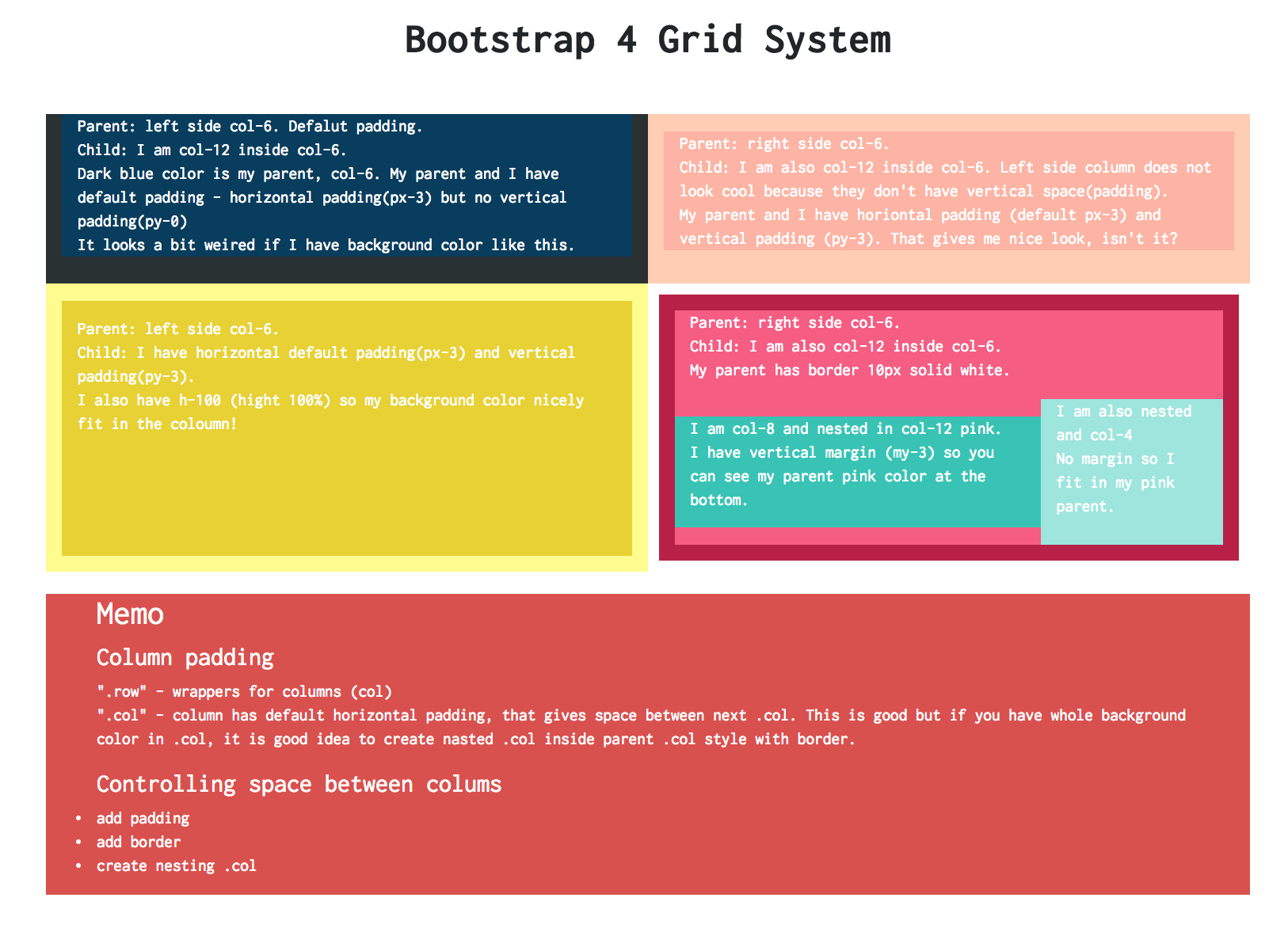
Bootstrap grid system makes it much easier to create a responsive website. I found there were some keys to remember when we make columns nicely.
When we make column using .col , each column has default horizontal padding (i.e.px-3 => padding both right and left). Default padding is only for horizontal, not vertical. We can easily change this by using .px- (right and left) and .py- (top and bottom) and even can reset by using .p-0(all). Through my experiments, when we make space between columns, it is easier to adjust padding but not margin. If you change horizontal margin, the column does not fit in a row anymore.
Here is my experiment: